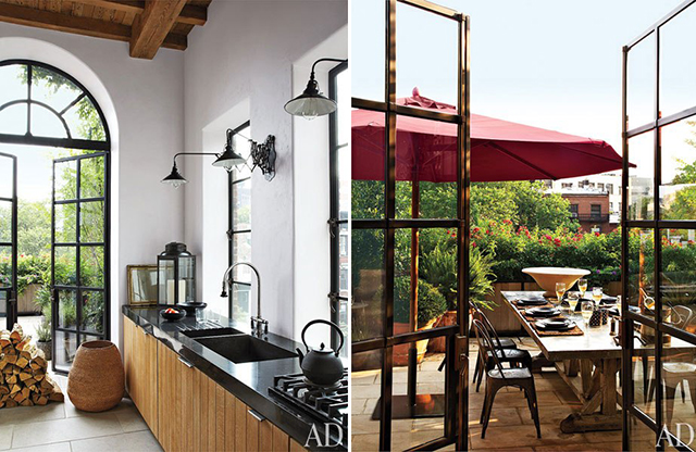
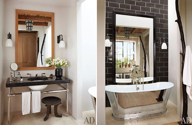
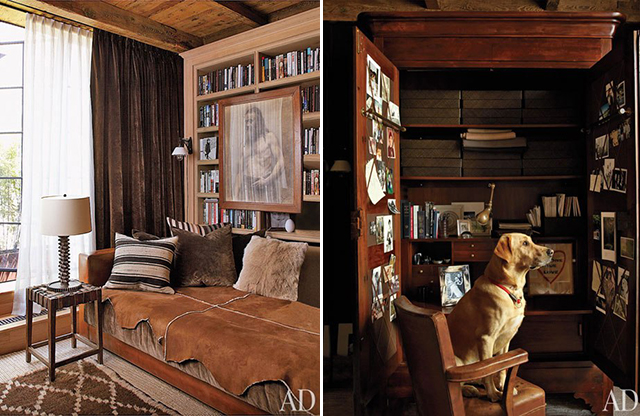
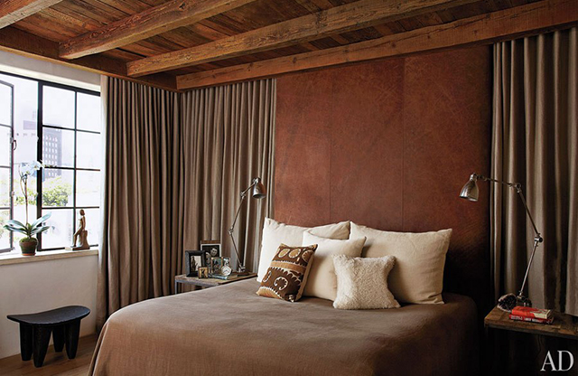
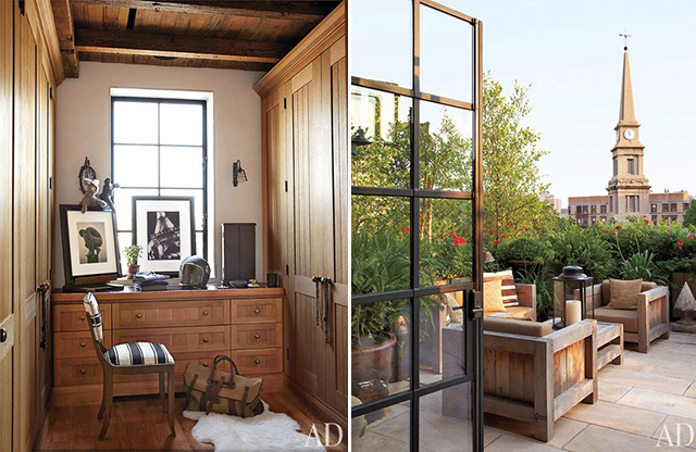
What was once a hospital in the 1920s now is the home of writer Brad Goldfarb and Ralph Lauren’s chief retail creative officer Alfredo Paredes. This 2,500 square foot East Village duplex was transformed with the addition of large-scale french doors, a timber ceilings, industrial lighting, vintage furniture and of course, Ralph Lauren fabrics. Masculine charm at its finest!
(via Architectural Digest)
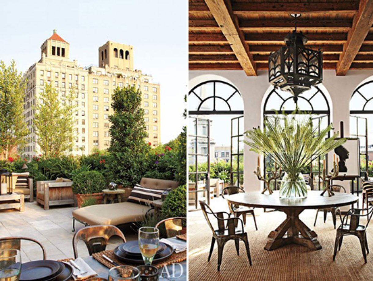
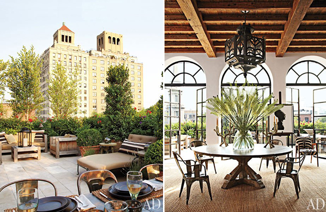
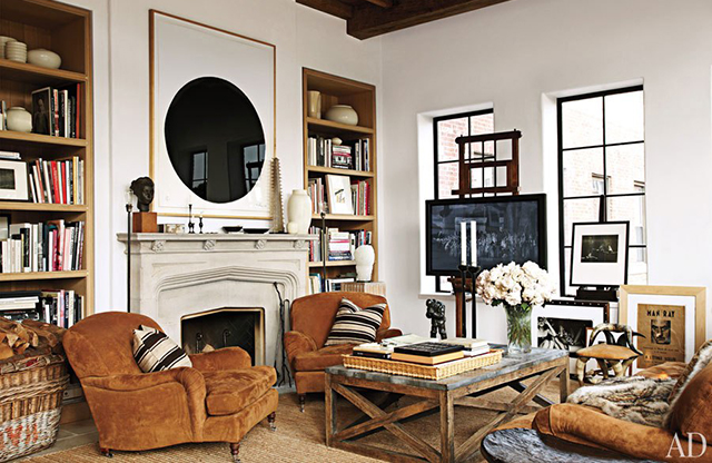
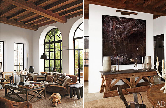
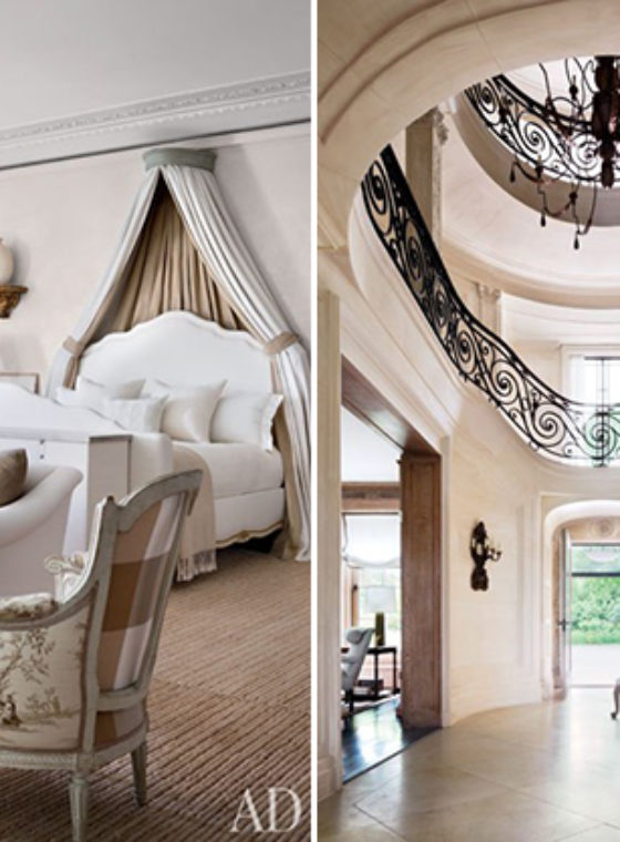
What a beautiful place!
Mafalda ❤
http://www.mafaldadotzero.blogspot.fr
It looks super pretty!!
XO CHAMAFASHION
http://www.chamafashion.com/
amazing!
That place looks perfect.
http://www.fashiondenis.com/
Oh my goodness, this space is incredible. I am beyond obsessed..
xo, Juliette Laura
http://juliettelaura.blogspot.com
http://www.etsy.com/shop/InfiniteStyleShop
This place is beautiful. If I lived there… I’d be scared to touch anything or make a mess, ha!
ashleeeybash.blogspot.com
so so cool. I would die to live there (even though it is a bit masculine!)
The Casual Classic
NOT REALLY MY WORLD, BUT THESE PHOTOS ARE SO COSY FOR A COLD WINTER DAY, LOL 🙂
FASHION BLOG BY A STYLIST FROM MOSCOW
https://www.facebook.com/diamondsandspikes
so gorgeous and warm x
http://www.vicariousLA.com
Gorgeous! Love the bath
Lauren
livinginaboxx
bloglovin
Wow, absolutely gorgeous! Nice place to relax and get some inspiration.
Magazine Blog: http://infatuationsbyelle.blogspot.com
What an amazing place! Lucky them!
http://www.apps-for-women.com
Oh my word. I am blown away by how amazing this place looks with such a simple, basic, color palette. Wow.
<3becky
http://www.loosefromthezoo.com
Hey Erica/HonestlyWTF,
This was designed by my office MNA (Michael Neumann Architecture)!
I love your blog and selection of items to feature everyday and am so excited to see you like our project too!
This project was also recently featured on Remodelista and won the Best Professionally Designed Dining Space.
Thanks! Christine
Wow it looks great!