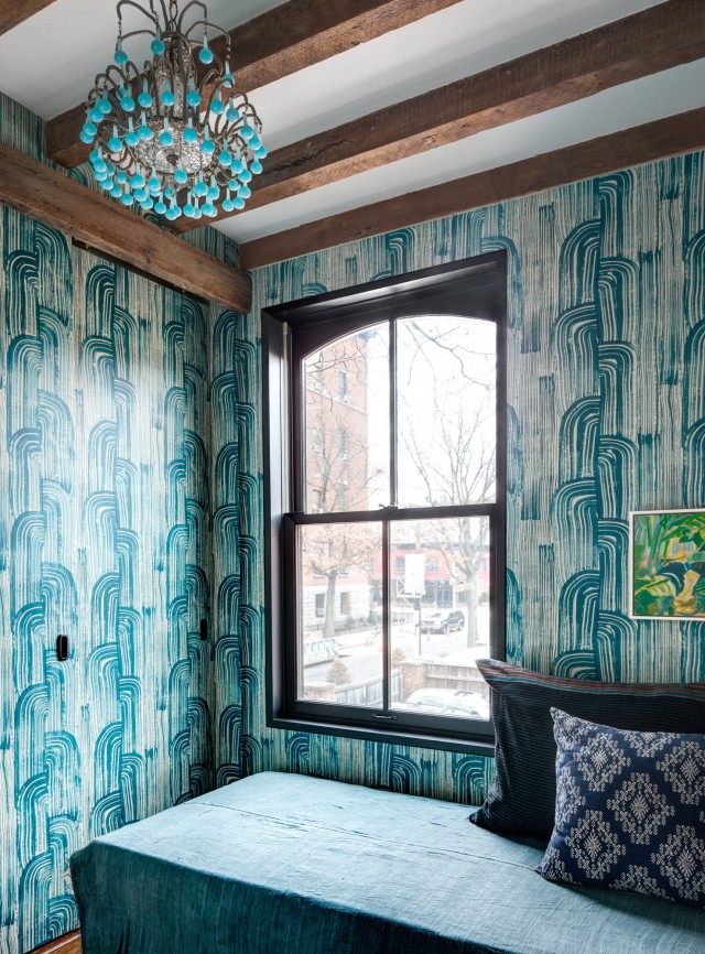
With it’s low ceilings, exposed wood beams, and undeniable allure, you would think this cozy townhouse calls somewhere like England home. But no. This delightful, three-story home is situated on Warren Place in Cobble Hill in Brooklyn – a street lined with English style cottages intended as affordable housing for laborers in the late 1800s. Couple Elspeth Benoit and David Bevan bought the house and gave it a much needed facelift, ridding the house of walls and stripping plaster to open up the space and reveal its original charm. I love the grey color throughout, the mix of tile, the chevron dining room floors and Kelly Wearstler wallpaper!
(via NYTimes)
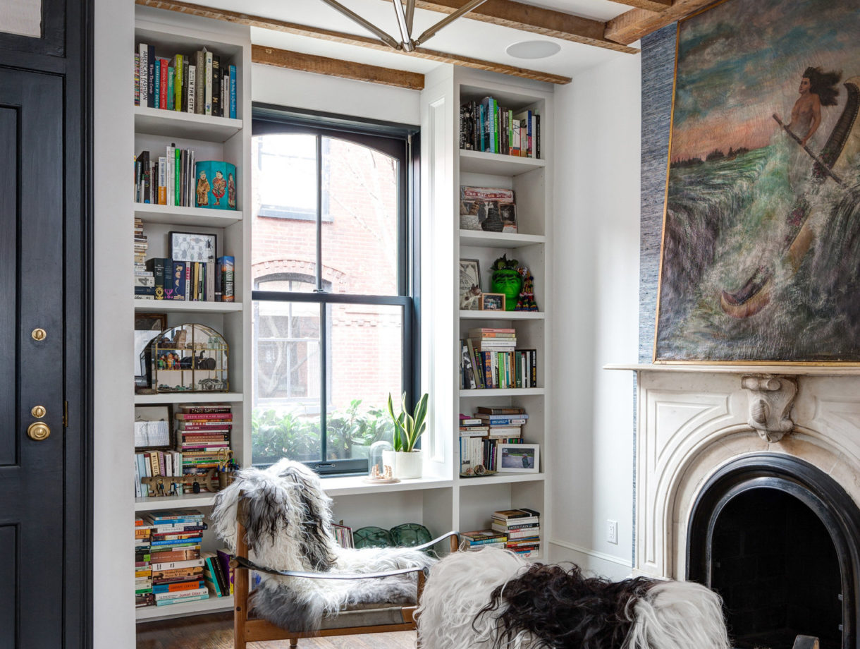
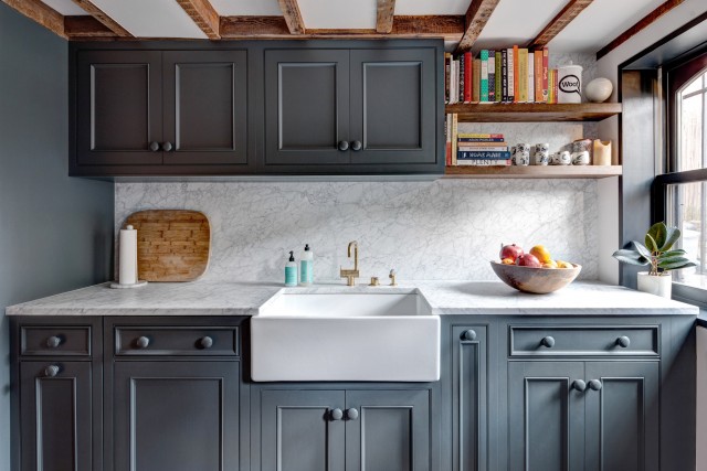
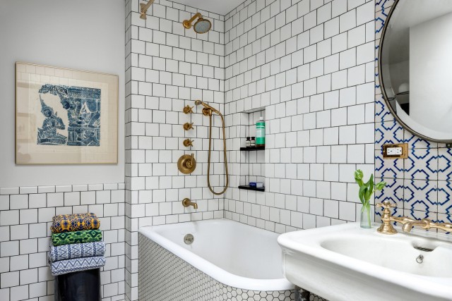
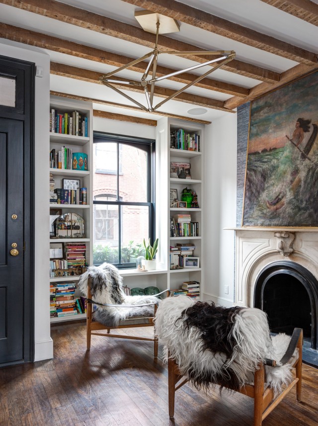
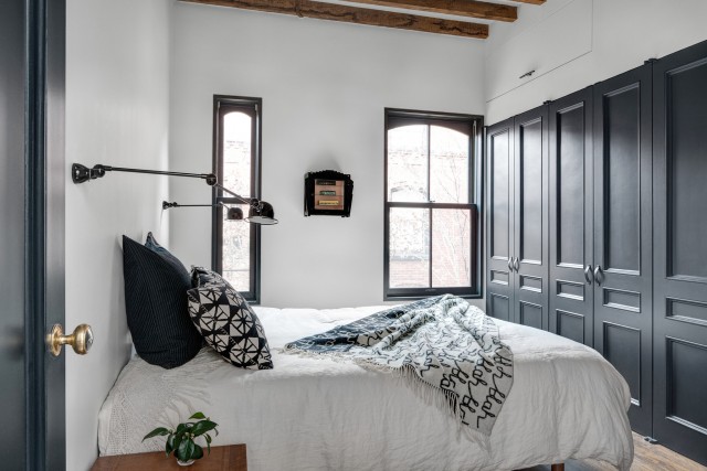
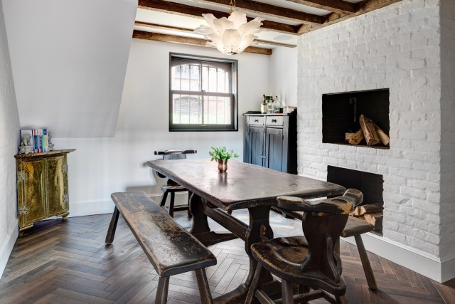
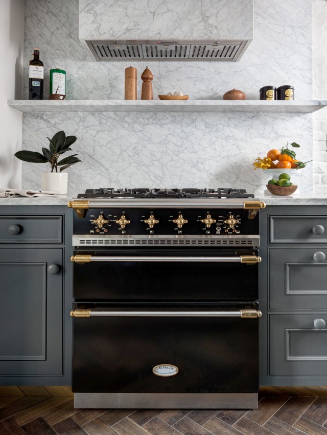
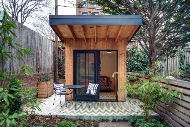
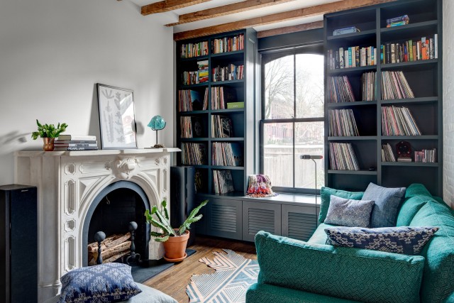
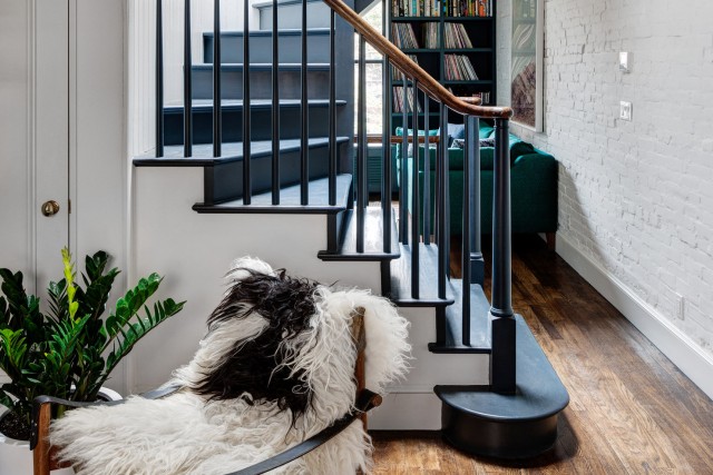
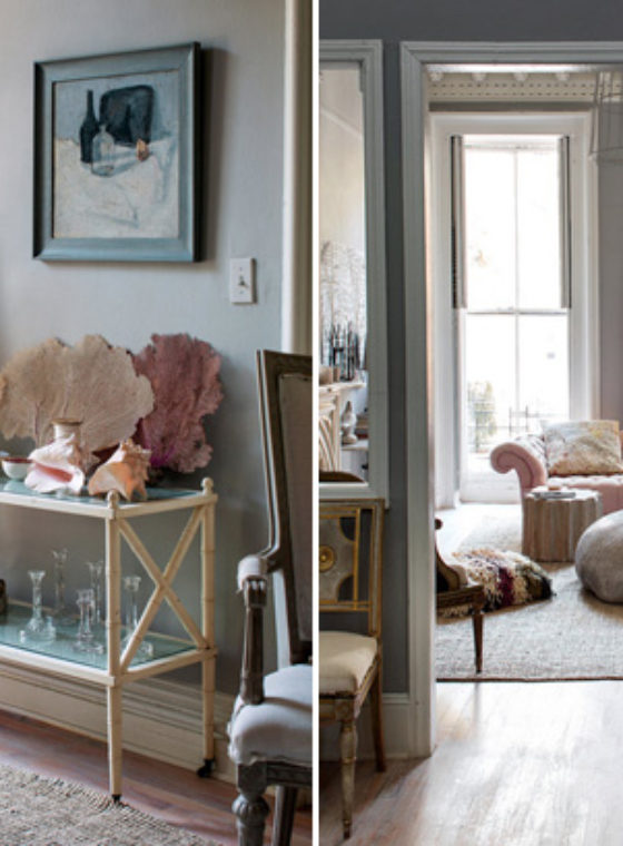

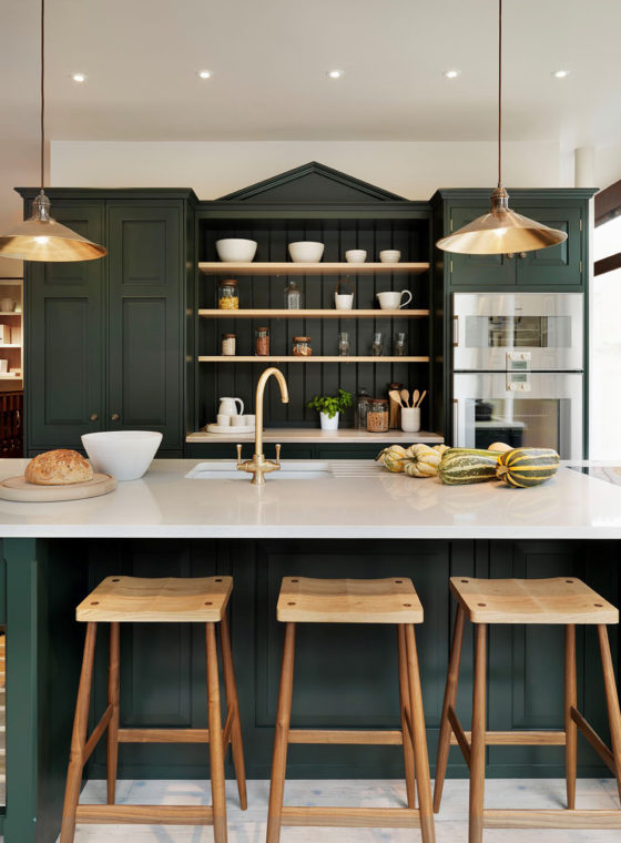
i love the accents of the dark paint…the kitchen at my old house was painted a similar dark color and i loved it. my house is a bit smaller now, so accenting something smaller would be ideal!
http://www.waterlilyshop.com
@waterlilyshop
This home is a beauty.
http://thinkworkandgo.blogspot.com/
Just love everything! Thanks for sharing.
I love everything, especially that unexpected pop of turquoise at the end!
Can I just live here? I love the mix of rustic and modern. It’s so me
http://www.littleblackshell.com
Perfection! Reminds me of the Mews houses in London. Amazing what can be achieved with a small space.
For a second I thought two sheepdogs were sitting in the chairs facing the fireplace.
Love this style!
http://www.mintnotion.com
Love the Kelly Wearstler wallpaper
Baanou
http://www.baanou.com
I absolutely love this! Those exposed beams…wow. The grey really suits it as well.
I love this decor…Do you know the brand & name of the dark greyish color used?
Pure gem! I am in love with this decor.
xxx,
Melie
http://www.lubiejewelry.com
Paris based, globally inspired.
Charming! x
Great place, love their details. Drooling over that robin egg blue chandelier.
So cozy and sophisticated with punches of color in all the right places.
Hey, this website is just fantastic, you are so good at showcasing wonderful artists and designers and great ideas. In the spirit o everything that you represent, please pay a little more attention to not-so-innocent-typos such as “it’s” instead of “its” or the other way around. You might ask “but why, what’s the difference, as long as you get the message, why be a Nazi? ” But I may ask the same about an ugly kitchen for example, or a hideous dress : “What’s the difference, as long as it gets the job done? I can cook my meals just fine or cover myself up all the same with this piece of junk? Why be a snob about it?” But you know that it just isn’t the same aesthetically and it gives off the wrong message. It’s the same with writing, isn’t it? All the more if it’s your job. Thank you and sorry for the rant, I wouldn’t be commenting if I didn’t care :))
Hey, this website is just fantastic, you are so good at showcasing wonderful artists and designers and great ideas. In the spirit of everything that you represent, please pay a little more attention to not-so-innocent-typos such as “it’s” instead of “its” or the other way around. You might ask “but why, what’s the difference, as long as you get the message, why be a Nazi? ” But I may ask the same about an ugly kitchen for example, or a hideous dress : “What’s the difference, as long as it gets the job done? I can cook my meals just fine or cover myself up all the same with this piece of junk? Why be a snob about it?” But you know that it just isn’t the same aesthetically and it gives off the wrong message. It’s the same with writing, isn’t it? All the more if it’s your job. Thank you and sorry for the rant, I wouldn’t be commenting if I didn’t care :))
Love the cabinets and color. Can you please tell me where you got them?
Hey Maria,
The Nazis didn’t care about punctuation, they were more into taking over the world and murdering everyone they deemed subhuman. Using “it’s” instead of “its” isn’t nearly as bad as lazily using the word “Nazi” when you only mean “pedant.”
Wow it looks great!